Showing posts with label process. Show all posts

Friday, April 05, 2013

VENOM #33 LAYOUTS


I keep meaning to post my layouts more often but generally forget to. Here are my layouts for Venom 33, which just came out this week. If you picked up the issue, you can see that the finished artwork pretty much stayed true to these layouts. For those who don't know, I actually lightbox these layouts (drawn 10x7.5cm) onto the Marvel artboard in order to keep all the compostitional elements as close as possible to what I did in the layouts. I spend a couple of days on layouts as that's where I figure out all my storytelling, lettering placements and figure out what reference I'm going to need. It's arguably THE most important process of making a comic, which is why it's also probably the most difficult and rewarding part.

Dec.

Tuesday, February 19, 2013

TEENAGE MUTANT NINJA TURTLES #22 COVER


Was very happy to be asked to contribute a cover for IDW's TNMT series. Was asked for a Shredder/ The Foot cover. Would have been cool to draw the actual Turtles but saying that, had a blast working on this piece. With this cover, I think that means I've officially worked for every major American comic book publisher (Marvel, DC, Dark Horse and now IDW), which is nice.

I asked colourist Nolan Woodard to wok with me on this cover and expected him to make this piece look extra-impressive. Clearly, that's exactly what he did. Below is the colour rough i did, along with the pencils and finished inks.


Dec.


Wednesday, February 06, 2013

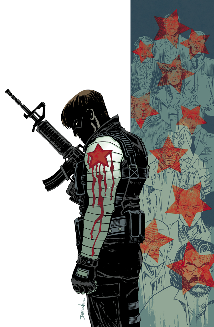
WINTER SOLDIER #15 COVER PROCESS

Eagle-eyed blog readers will have noticed by now that I've been contributing covers to Marvel's WINTER SOLDIER. The series was already a favourite of mine, and with issue 15 it was changing hands to the excellent creative team of Jason Latour and Nic Klein. Series Editor Lauren Sankovich contacted me about providing covers for the first arc by this new team. As fans of both creators (I was a huge fan of Jason's artwork, as well as his writing on LOOSE ENDS as well as Nic's phenomenal work on DANCER for Image) and a fan of the series in general, I was more than happy to be a part of this really dynamic creative team, in some small way.

As this is my first Marvel cover for a series I'm quite passionate about, I thought it appropriate to peel back the curtain a bit and take you through the process of creating the cover.

Here's the final, printed cover.


 When I was working on the cover, Nic hadn't yet signed on to to the book, so I discussed cover concepts with our editor and Jason too. Two elements I was determined to use was the red star associated with Winter Solder, as I thought it was a really strong graphic element that could help make the series covers distinct. For the same reason, I also wanted to keep a limited colour scheme for the series of covers. Thankfully, the editor liked the graphic/conceptual covers I had doing in the past months for other publishers, and Jason has a great eye of design anyway, so my approach was encouraged by the team.

Below are the four strongest cover concepts I had for the first issue. I had more, but I will generally pick the ideas I think are the worst, eliminate them and hand in the best ones. I've found it helpful as in the past, editors can end up picking the ideas you hate the most (though not on this book), so this way, I eliminate the ideas I think are the worst, and never end up working on an idea I'm personally unhappy with. That way, no matter which idea is picked, I'm still happy to work on it.

I handed in these ideas in colour, to help show the unified approach I mentioned earlier. I was working from Jason's overall plot pitch for the series, so while I had no story specifics of this issue to work from, I did have some overall themes and ideas for the series. One strong element to the series was Winter Soldier having to deal with his murderous past, so I honed in on that idea. Winter soldier has had a more Captain America-star emblem on his shoulder in Ed Brubaker's recent run, but I wanted to feature his old Winter Soldier Communist-inspired star to represent his past/guilt. For the rest of the covers, I've illustrated a contemporary Bucky, but have kept the star red. Of the four concepts, I was most happy with version A and C. Everyone liked the idea of the star bleeding; really pushing the blood-on-his-hands idea, and the red of the star connecting both Bucky and his past victims, so we went with version A.


It turned out Jason was playing the idea with changing Bucky's star for this new direction, as it marked a new period in Bucky's life so we toyed with a black-star on red and other variations. We went with that idea; I needed the red to make the blood work but we could always change it down the line. I made a mock up of the cover to make sure everything would fit together in the final image (above)

I got to work with Jordie on colours on these covers, and it was pretty cool to bounce stuff back-and-forth with her. She suggested with the background victims, I should just draw them all fully, and she could make a star 'stamp' in photoshop. She could then have more options with placement. I've found I get the best results with Jordie when I give her the space to contribute to the image more. The more Jordie contributes to an image, the better the end result is. Anyone who has seen the covers for Image's COMEBACK series will see this too.


The pencils and inks for the cover. I was on a real Cold War era buzz wile working on these, so for the background victims, I based them all on characters from Florian Henckel von Donnersmarck's 'The Lives Of Others', a German film set in that time period.


I think it was Lauren Sankovich, the editor, who suggested that the red stars would be best placed as head-shots, rather than various bullet wounds. I think it was a smart idea, as while my original concept had more shots, the bigger stars as head-shots communicates the idea more efficiently. Jordie added her usual magic and managed to make the star-shots clear, but also keep my drawing visible. Was really impressed with that; I had expected them to be completely covered, but drew them in full to give Jordie more options. She thought the black star wasn't working, so made it red and I think it was the right call. Keeping the star one colour pulls the eye in more, I think. Jordie did a great job; she ended up adding more colours that the extremely limited colour palette I originally had in mind, but with that, she also added a lot more sophistication to each cover, kept the palette as limited as possible and still unified the look of all the covers to this arc; she has done outstanding work.


Here's a detail. I really love the metallic sheen on the shoulder; really makes the star pop too. Managed to separate the star subtly too.

There were some final collaboration and tweaking to the final printed cover; both myself and Jason wanted to keep the Winter Soldier logo one solid colour. In the previous issues, there was a metallic sheen over the logo and while it looked great, we thought it clashed with the more restrained, propaganda-poster feel we were going for. If I recall, Jason and I wanted a red logo, but Jordie and Lauren wanted a grey colour. As you can see, the ladies won, and I can see why; it looks great. Afterwards I was told that Marvel were bringing in a new design element to their Marvel Now line, but thankfully there was enough negative space in the cover to accommodate that.

Well, that's it. Thanks to Lauren, Jason and Jordie for making my first Marvel cover such a rewarding experience. Make sure you go and pick up WINTER SOLDIER #15, OUT TODAY!

Dec.

Tuesday, August 14, 2012

VENOM #22 INTERVIEW, LAYOUTS


I was recently interviewed on Newsarama about starting on VENOM, the upcoming 'Minimum Carnage' crossover and I'm sure I moan about something or other. You can read it here.

Also, when on T-Bolts and Dark Avengers, writer Jeff Parker had a great response when he posted my layouts so I thought I might start doing the same here, with my Venom layouts. So, here are my layouts for the whole of issue 22 of Venom. Ask away in the comments if you have any questions and I'll do my best to answer them.

Dec.

Thursday, July 05, 2012

VENOM #22 FINISHED


I handed in my first issue of Venom last night. It's the first chance I've had to work with Rick Remender. Considering how much I loved working on this issue, I certainly hope it's not the last.

Here's a little WIP peek.

Dec.

Thursday, April 29, 2010

28 DAYS LATER #13 COVER

Here's a cover i did recently; for issue 13.


Really happy that i got to do a decent; design-y cover that still pertains to the interior story. It ended up being really close to my original layout, i think...


This is the first time i did my thumbnail/layout digitally and it turned out pretty well; i did mess around with it a lot; i had to be sure to leave one corner pretty bare so that the logo would be clear and readable, so there was a lot of selecting and moving the image around until i was happy with it. I think it was Mooney who suggested i do a wash on the 2 characters to separate them from the car bonnet. I threw in a bit of mis-registered halftone too, just to make it a little more interesting and also as i missed the chance to use that effect in the previous cover.

Hope ye like,

Dec.

Thursday, April 01, 2010

28 DAYS LATER #12 COVER [PROCESS]

Hello there; time for another process post on the auld Dec-blog... aw man, i totally should have called this 'The Dec-Blog'. Ah well.


I was handing in cover ideas to my editor at BOOM! Studios, one of which being the above. Issue 12 called for a 'Someone WILL die' vibe, so i thought this would be the perfect chance to go with this (very rough) idea. I wanted to do a really bold, graphic, stylized cover... actually, i've been trying that approach with all the covers so far, but this was me trying to be a little braver in approach.


Here's the fully inked piece. from the layout you can tell i was planning on changing the black line art to red, but once i tried, it just didn't work. It didn't 'pop' like i wanted it do. If anything, it looked too flat. So with a bold composition, i tried a bold colour scheme....


I showed it to a couple of the Micks for some feedback. It was suggested i colour the arm in the foreground with solid colour but i was pretty keen on going in this direction...

...except my editor wasn't as keen. He asked if i could colour it 'more traditionally,' which is fair enough. So, i had to try do that, yet keep it bold, otherwise what was the point of doing it in the first place? So, to keep it consistent with the previous covers (ie a black/white/grey/red colour scheme), i added greytone to Selena's arm, and coloured the blood in bold red...


And here we have it; the final cover. I do still prefer the original colour version, but i do think this version totally works. I saw the cover online today, and was a bit surprised to see the 28 Days Later logo so big on the cover. Then again, it was a bold composition, and the logo looks big and bold, so as a cover, i think it really stands out. You can see it here.

So that is my heroic story. I got to say 'bold' a lot. Hope ye like the cover. I really do; to editorial's credit, i didn't think a cover this minimalistic would get approved; you can tell from a lot of comic covers that some editors thing you should fill a cover with lots of characters and lots of colour. Here i got to push my 'less is more' cover approach. That may be why this is my favourite of covers i've done so far.

Dec.

Monday, March 08, 2010

28 DAYS LATER SPREAD [process]

Below is a double-page spread from 28 Days Later #6. If you haven't read it yet, it's best you not read this post.

As a way of saving time, i've recently stopped scanning my pencils, so i thought since #6 is still relatively new, i'd post a stage-by-stage version of this spread. I've explained how i work ad nauseum at this stage, so i'll skip the monologue this time and just show ye the layouts, pancils and finished inks of this page. Hell, i'll put up Nick Filardi's colours while i'm at it.

Saturday, January 02, 2010

28 DAYS LATER COVER #9 [Process]

I mentioned before on this blog that i'd love a chance to work on some covers for 28 Days Later. Well, soon afterwards i was actually offered my first cover. I saw an image of it online this week, so i thought i'd post a 'process' post, showing the making of the cover as i haven't done one in a long time.

Right, well by the time i was offered my first cover, both Tim Bradstreet and Sean Phillips had done a fair few covers. How was i gonna follow them? Well, Tim Bradstreet had been doing some red-dominated movie-poster style covers, whereas Sean Phillips had been doing more hand-drawn, heavily designed ones, with a strong use of black, white, red and greywash (see below).

Sean Phillps' covers for 28 Days Later, issues 1-5.


I had been getting some favourable comments on the greywash work i'd done on the Eclectic Micks blog and well, i just preferred the hand-drawn look of Phillips' covers, so i thought i'd take the look he established for the covers and work within that remit. I personally love that colour scheme anyway, and i like playing with white-space, so Sean Phillips had already been doing the type of covers i would like to do. Illustrating covers in that style i think actually helps the covers become recognisable as 28 Days Later covers specifically, and so when you see one of these covers they instantly stand out from all the other covers on the stands as being 28 Days Later, which is really what you want in a cover, i think.


So, i submitted some loose cover ideas to my editor, Ian Brill, and he chose this one. I normally flesh out my layouts a lot more than this, but i didn't want to commit to any layout too much as i had no clue as to which idea my editor would pick. With this one i wanted a cool image of Selena in her mask (it just looks a little more sci-fi when she wears her mask) and a design-y montage of various infected. Normally i would have more fleshed-out images in the panels but like i said, this was just a very basic idea. The important thing was that the composition was all laid out for the pencils.


I then lightboxed the layout onto my marked-out page. I've mentioned before how i like to lightbox my layouts as to keep the composition as close to the original layout as possible, so it retains an element of the original spontaneous drawing. I had a little more work to do in the pencils this time, as i really hadn't figured out what the images in the panels were going to be, so i had a bit of fun trying to come up with various images of the raging Infected.


Inking. My favourite part. I tried to make the two different elements very distinct; by having the line drawing of Selena a little more refined, and adding shading in greywash (that was a bit of work) while having the Infected panels inked very messily. A lot of ink got into the white ares around Selena but i just took them out in photoshop. Though i do deliberately mess-up my pages in ink, i still spend a lot of time in photoshop deciding what works and taking out what doesn't work.


I then mapped out the areas of the Infected panels, filled them with grey in photoshop and changed them into halftone. The plan being to convert the halftone to colour down the line. I'd been playing around with this effect and i thought it might help differentiate my covers from Sean Phillips' covers somewhat.


I like halftone to look big, retro and kinda old-school. Problem is that when the dots are that big, areas of detail in the line art can get lost. You can see here that the Infected's pupils are obscured, and i really need details like that to be clear. It's okay though, because as i mentioned, this halftome was going to be colourized, it didn't matter that the dots were big. It was better in fact. When messing around with colouring halftone before i noticed if the dots were small then they totally got lost in the image. Black halftone though, works fine if smaller.


And here we have the final image. As you can see i added in a flat red (as suggested in the original layout) in the Infected panels and changed the halftone into a dark red. You might also notice that i went in ad cut out the tone in the background ares of the Infected panels and in the pupils of the infected too. I think it helps them 'pop' a lot more.

Well, there you have it. My first 28 Days Later Cover. More to come. Not gonna do a 'process' posts for anymore mind, as they take too long to do, so i hope ye enjoyed this one.

Dec.

[P.S. Big thanks to Sean Murphy for showing me how to use colour halftone so i could try it out on this cover]

Friday, August 14, 2009

28 DAYS LATER #1; PAGES 1-3 PROCESS

Since i've posted the first three pages of the new 28 Days later book, i thought i might show the steps i took to make them.

Obviously, first i read through the script a few times. Then, i take out my sketchbook and get started on the layouts. This is the most crucial stage, as this is where all the storytelling, composition, letter placement and problem-solving is figured out. It's the toughest stage, but also the most rewarding.

You can see i made a note of 'no hands' at the bottom of the second layout. I think i got carried away and thought the child looked in the tent first. Upon rereading the script i realized that was my own imagination, and that the football pops out of nowhere in the next page. You have to be very careful of details like that.


Layout pages 1-3 from my sketchbook


Then, instead of redrawing the whole image from scratch, i blow up the layouts and light-box them onto an A3 sized page. I do this in an effort to retain the spontaneity of the original layout. In the past, i've completely redrawn the image, but it always lost 'something'. I'm mush happier with the end page when it's as close to the original layout as possible.

As you can see, the drawing is much more fleshed-out; establishing proper light sources, folds in cloth, and just overall adding more detail. I do leave a lot of work to be figured out in the inking stage. For example, in the first page, you can see i just made a circle for the light from Selena's torch, leaving a lot of it to be worked out in the inks. Because i ink my own work, i like to leave a lot of embellishment for the inks, and have the pencils be mainly construction.


Full-sized pencilled pages 1-3


Finally, my favourite stage; Inking. I just enjoy the solid mark-making involved in inking so much; it's very satisfying. I try to be as loose as possible when i ink. All the detail added in the pencils can end up inked very scratchily, if that's a word. Basically, just because it's been pencilled doesn't necessarily mean it will be inked; it depends on whether i think it will look good or not.

In the case of page one, i actually ended up adding a lot of texture, especially in the last 2 panels. I'd drawn the basic forms in pencil, but waited til inking to properly work them out, using varying kinds of line, splatter from my brush/pen nib. I think i even went back to the 5th panel and added thumb-prints in white ink. In the second page, when i had done all the line-work, even with all the white space, i thought the environment didn't look 'snowy' enough, so i sprayed white ink all over the line-work, to break it up and add more atmosphere. When inking i now try and create as many 'happy accidents' as possible, ie, ending up with something on the page i wasn't planning on having, be it a loose line, or a blob of ink. It makes the pages look more like an interesting drawing, i think.


Finished inked pages 1-3

Well, there you have it. Pages 1-3 in all their stages and me prattling on about it. Hope you found it of some interest.

Dec.

Monday, April 27, 2009

TODD CLOSE UP [PENCILS]


Whoops! Nearly forgot to post today... i get confused which day i need to post as when i'm posting every second day, the actual day changes each week.

Here's a close up of a new panel from Sweeney Todd. The script asked for him to look really sinister and i reckon i managed to achieve that. Really looking forward to inking this panel, actually.

Dec.

Monday, April 06, 2009

PANEL SCAN


I have this great 'Art of Hellboy' book which obviously, has lots of Mignola goodness in it. One of my favourite parts of the book however, isn't the (lovely) Hellboy water-colours he has, but the scans of his black and white pages. What's great about them, is that they're not cleaned up or anything; you can see the different levels of ink he used, the heaviness of the ink lines, etc. it's the next best thing to looking at the actual page. So, here's a reasonably big scan of a section of a recent Sweeney Todd page that i haven't altered. If you look, you can pick out parts that were done with dip-pen nib, brush pen, inky fingerprints, actual indian ink and various splatter effects.

I'll post the whole cleaned-up page in a few days.

Dec.

Saturday, April 04, 2009

SWEENEY TODD PAGE 65; LAYOUTS TO INKS

Well, it seems no one objects to seeing layouts so i thought i'd show a page from Sweeney Todd, but show it from original layout to finished inks. Below you can see the layout for page 65. I sent it to my editor at Classical Comics for approval. Sometimes the layout needs to be tweaked, like if i haven't left enough room for speech bubbles, etc. It happens from time to time; but not often.


There were no real problems with the layout page, aside from how the character in panel 5 had her finger to her lips. The script instructed her to do so in a certain way, with the palm placed flat facing her face, rather than placed on its side. However, my editor asked me to ove her finger to the centre more, rather than at the side of her mouth. Other than that, i could go straight to pencils.


Long-term readers are probably aware of my work-process, but just in case, i blow up my layout page and lightbox it onto the full-size artboard. That way i can try to keep some essence of the spontaneity that the original sketch had. By keeping the composition as close as possible to the layout, i think the end page ends up a bit more engaging. I sent the pencils to my editor, but there was an issue with the last couple of panels. My editor was concerned that the character in panel 5 was silent (mouth closed, finger to lips) yet was speaking, so asked me to make the final panel bigger so the speech bubble could be placed there instead.


While inking, i wasn't 100% happy with the arm of the character on the left of panel 4, so changed it slightly. I was also wary of the page looking dull as it is essentially a talking scene. I had used a non-standard layout to make the page more visually engaging, but i also tried to do that in the inks too by breaking up some 'dead' white areas with black ink-splatter and using white splatter to indicate sunshine coming through the window in panel 2.

Well, that's it. A whole Sweeney Todd page form start to finish. Hope this was moderately interesting.

Dec.

Thursday, April 02, 2009

BATMAN COMMISSION 2.0

Hi chums. Regular readers would remember this commission from late last year i did of Batman and his Rogues gallery.


Well, i'm finally getting around to giving it to my gracious benefactor but when i looked at it , it was looking a bit old and stale to me, especially considering the messier approach that's been creeping into my work of late. So, i decided to go in and add some greytone and splatter. I've been doing a lot of sketches with those tecniques over on the Eclectic Micks blog of late, and they've been getting a good reaction so they were worth trying out here.


Well, here's the finished piece; hope you like it Dave!

Dec.

Sunday, March 29, 2009

COVER SKETCH


I dunno about you guys, but i love seeing layouts and thumbnails on artists' blogs. If ye don't want to see them, let me know and i'll stop posting them.

Anyhoo, this is a thumbnail to a cover i was asked to draw recently. I was given some elements to be included in the image and came up with the above. In the end, some changes had to be made so i had to come up with a whole new layout, but i quite liked this sketch as it is, so up on the blog it goes. What blog you ask...? This blog ......the one you're reading right now.

I'll post the finished piece once i get the okay.

Dec.

Tuesday, March 03, 2009

SWEENEY TODD PAGE 50 INKS


Here's the inks for page 50. Quite happy with the end result here. You can see that i fixed all the stuff that i mentioned was wrong with the pencils in my last post.

I've been using a pen-nib tool for the last few months and got some really nice and loose lines with it on this page (see background characters). Feel like i'm finally getting the hang of it. I also got some nice variation of lines with my brush-pen. I found that when i started using the brush pen, i did a LOT of drybrush. A month or so back, i seemed to barely use any dry-brush and started inking a lot more slickly. Nice to be able to do, but i'm not really interested in slick inking ('slinking'...?). I want messy pages, with lots of texture, so i'm trying to balance the 'slick' with some very gestural lines, and some splatter here and there. It seems to be balancing well in this page, and with most of the pages i've done this week.

Hopefully you all agree.

Dec.

Saturday, February 28, 2009

SWEENEY TODD PAGE 50 PENCILS


Here's the pencils to page 50 of Sweeney Todd. I posted the layouts to this page earlier in the week as well as a detail from one of the panels. You can see that i stuck extremely close to the composition of the layout. I realised in panel 2 however, the the width of the street was a little too narrow (i remember really wanting to have a solid black on the right of the panel to help separate it from the rather large first panel), so i widened it a bit. Because i did so, it was pointed out to me by fellow comics artist Stephen Thompson, that it looked like the barbers pole was coming out of one of the characters' head. In trying to fix one problem, i had created another, so i would have to fix that in the inks. I also had stubble on the wrong character, so that had to be fixed. There was a couple of things my editor suggested i fix up too, so it was no big deal. I'll post the inks pretty soon. Tomorrow maybe. Or later, i dunno, i can't see into the future now, can i?

Dec.

Tuesday, February 24, 2009

LOST PANEL


This is a panel lost to the ages. I originally added it into a Sweeney Todd page of my own accord, just to add another beat to the storytelling, but it ended up cluttering up the page a bit, so it had to go. Shame; i liked the drawing and was looking forward to inking it. Ah well, what can one do....?

....well, i guess one can scan it and post it on their blog....

Dec.

Sunday, February 22, 2009

SWEENEY TODD PAGE 50 LAYOUTS


Quite busy with Sweeney Todd at the moment, but here's a layout for one of the pages i'm working on. It was a pretty straight page script-wise, but i really wanted to come up with a more interesting layout design. I've also gone back to doing smaller layouts, with an added greytone to make it clearer. I was doing bigger, more laboured layouts in pencil, but by the time i worked on the actual page, it felt like i was pencilling it twice. I'd get tired of all the pencilling and the pages srarted to feel more dull as a result. Much happier with this approach. I'll post the pencils in a couple of days.

Dec.

Wednesday, January 28, 2009

ACTION!


Yet another pencilled panel from Sweeney Todd. I'll post a full, inked page soon; i pwomise.

Dec.