Wednesday, September 27, 2006

Freak Show #2 Pencils

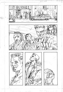
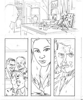
Here's some pencils to an inked page you've seen, and one you haven't. I'm off to Scotland for the weekend, so spending this week on pencils. I find pencilling the hardest stage so i need to be in my studio (/bedroom) to work on them. I can ink pretty much anywhere (aside from on top of a moving train or the like) so i can ink away in Scotland, without having to worry too much about missing out on work.


Changed a few things with the inks here. The perspective on the lamp in the middle of the first panel was a little off, so i fixed it in the inks. Added more black in areas too. Think i messed up the telephone chord in the inks to be honest, but there's no point spending all day trying to fix something. Best to move on and spend your energies on the next piece.


First page where i've had a good, proper take on the Freak Show characters. Since no one has seen me draw them before, it's pretty important early on to clearly establish who they are. Not 100% happy with Jack's hair in 2nd panel, reckon i'll change them in the inks. I think the hearse in the 1st panel is too small now that i take another look at it. Will have to adjust that in Photoshop. No biggie. Really happy with this page overall.


Dec.

Tuesday, September 26, 2006

First pages of Freak Show #2

Hey kiddies, tearing through #2 of Freak Show when i realised it's been bout a week since i last posted some work, so here's some pages to prove i'm getting some work done. I'm leaving out pages which would give away too much of the story, so enjoy these for now

............or y'know, don't enjoy them, see if *i* care.

These pages include my first proper takes on Jack and Susan in sequential pages.


Dec.

Wednesday, September 20, 2006

Started work on Freak Show #2

I found it funny that when drawing the first issue of Freak Show, i didn't get a chance to draw any of the main characters till the last couple of pages. On the other hand, the anticipation of drawing all the characters kept my interest high. Like in Batman Begins, you wait for ages to see Batman in costume and when you finally see him, it makes the reveal all the more satisfying. Anyhoo, i'm rambling. I just wanted to post this panel, it's not the first appearance of all the characters in issue 2, but it's the first panel i've drawn where they're all included. They are from left; Myles, Elizabeth, Jack (two characters appearing in this story) and at the end, Susan.


In other news, another review of Hero Killers is up on the Comic Book Resourses website. The reviewer compares my work to that of early Steve Rude work. I love Steve Rude's work, so i take that as a huge compliment.

http://www.comicbookresources.com/columns/?column=10

Dec

Monday, September 18, 2006

More 'Felon' work.


I mentioned i was also working on something that for the meantime, i'd refer to as 'Felon'.
Did some more pieces, a character piece and a test page. Working on a colour theme too, so tested a couple of colour versions too. Nothing set in stone with it yet, still playing around with it.


Dec.

Saturday, September 16, 2006

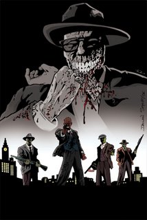
Gangster/Zombie pages


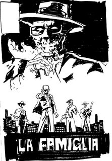
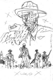
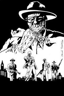
These are the first pages produced for the zombie thing i've been harping on about. Got the script for the second Issue of Freak Show, so i'll have to get crackin on that and put this zombie thing back on the shelf for a few weeks again.

I've been using a lot of line on Freak Show. I've been using this Zombie project to play with heavy blacks, shadows and the like. Been taking out some linework in places to see how i feel about it, most noticably in the very first panel. Note that pretty much the only line is the horizon on the ocean, the rest is solid black. Really like the results so far. Decapatated zombie-head was fun to draw too.


Dec.

Monday, September 11, 2006

Me again.

For anyone who happens to wander onto this blog and like what they sees, i gotta point you to a far superior artist called Kevin Knowlan. I absolutely adore his work. He's known primarily as an inker but hegoes so far as to pencil, ink colour and even letter his own wiork. I love what he does when he inks (his work over Gil Kane is amazing) but it's when he does it all himself, well, i just can't describe how great it is.
Saw this interview with him on newsarama. Well worth a read.

http://www.newsarama.com/TwoMorrows/RoughStuff/Nowlan/RS_Nowlan.html

Dec.

Saturday, September 09, 2006

Process of a Comic Cover.

Hello there.
I've posted these pieces before, but since i've been getting a good responce to the last post, showing a cover step by step, i thought i'd repost them all together, including colours. I sent off the finished black and white piece to the writer of the comic, Dwight L. Mac Pherson, and he in turn sent it to the colourist. I had no idea what the colours were going to look like. It's odd to give up your baby for someone elso to finish raising it. I've been a good parent; i've raised all my boys and girls so far, but after seeing how someone else can do the job, i'd be more than happy to put my future kids up for adoption.

I've really stetched that analogy out as much as i possibly could have, haven't i?


Pretty sweet, huh? Many thanks to the colourist, Mike Dolce, who i'm sure you'll agree did a bang-up job.

That's all for now,
Dec

Tuesday, September 05, 2006

Process of a Cover: Adding colour.

I was showing work around in San Diego a month back, when i met one editor who liked my work. He said to me, "I can tell you have a great sense of where you want colours to go." Of course, i agreed with him and told him i knew exactly what colours i'd use when colouring. This was black and white artwork, by the way. The truth is, i haven't a CLUE about what colours i'd use if colouring. When i draw, i think in black and white. When the time comes to colour a piece, i really have to look at a piece for ages before i can figure out how exactly i'm going to ruin this black and white work!

Well, anyway, here's how i go about doing that.
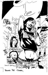


Well, first i look at the black and white piece, imagining what colours i'd put where. The only thing i thought i might go with was having the wall green, and the graf above pink. The vampire character had to have a white bleached part in her hair and a blue and red t-shirt, cuz i'd coloured an image of her with those colours, for a banner months back. So, i get started. I tinker with the image on Photoshop, preparing it for the colouring stage. Then i just get on with 'flating'.
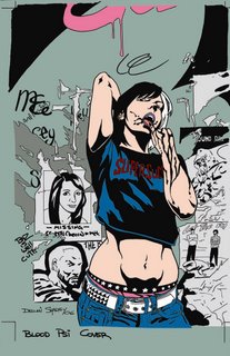


'Flats' are where you basically map out where the colour will go. The colours you use aren't really important, you just trace under the black line art with the mouse and fill it with a block of colour. As you can see, i filled in areas with colours like those i had in mind. You can chance colours to whatever you like after this, but i thought it was looking okay at this stage, so continued colouring using these colours for now.
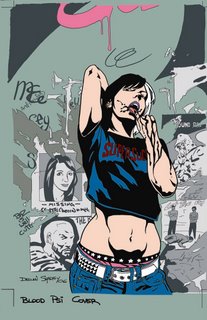


I knew I wanted the vamp to stand out some more, so after i seperated the posters with more greys, i did a colour-hold on the background line art. Not sure how visible it is here, but the linework is changed to grey where the vamp's remains black. She stands out more that way. At this point i was going to add texture to the wall and shading to the character. I took a break and had a shower. When doing the showering thing my mind wandered (as it does) and i realised the colours i was using were too boring. I like muted colours, but this was a cover. It had to stand out on a shelf so i thought i'd be a little more daring. I decided i needed some Red.
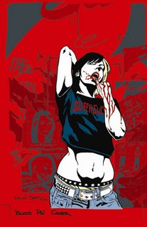


When i came back, things got radically different. I went with a powerful red for a background and made any other background details a different tone of red. I then thought, "Why is her skin pink? She's a Vampire, for feck's sake!" When adding flats, i had gone with a basic pink, and never changed it, so i went drastic again; pure white. BAM! It was coming together. The image demanded more attention. See, cuz my work is mainly solid black and solid white, i can get away with hard, graphic colours. There wasn't much point in doing a heavily-rendered image on this cover, it would end up being too fussy and confuse the eye. I needed something to attract the eye, and the basic red-and-white approach did that. I made a dark-red colour-hold for the blood and brightened the red on the t-shirt to match the background. I Also added a light yellow to the hair and other details. The important thing now was to keep the colour palette limited. If there were too many different colours it would work against keeping a simple approach.
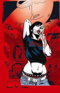


Now, the image was basically done, but i wanted to add a couple of extra touches. First, I adjusted the grey colour-hold to compensate for the new red background. Then I changed the colour of her underwear to match the blood, unstead of the hair. I added a soft gradient to the background to give some indication of a lightsource, but also to soften the background a little. On top of that, i thought when the logo was on the cover it would stand out a bit more against the light area. The important thing was to make sure i didn't lighten it too much, otherwise you'd be distracted from the white skin on the vamp, and it was she who had to stand out most. I thought i should add a little shading to the vamp's skin. Just a little, mind. There was so much white i wanted to tone it down just a little, so added some soft grey shading to some areas.


So that's it. All done. Ended up quite happy with it in the end. I really liked the black and white version and was scared of ruining it but in the end, it worked out okay. The only thing left to do is to thank Andy Winter, who offered the cover to me, Marianne Kenny, who was kind enough to model for the vampire character (the piece ended up WAY better cuz of it. I know that for a fact) and also her sister Cecily Kenny (who gave me permission to ask her little sister to model in the first place!).

Also. thanks to everyone who left comments on the last post and to whoever comment on this one.

I'm outta here.

Dec.
Friday, September 01, 2006

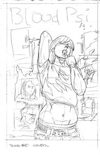
Process of a Cover: Blood Psi, step by step.

Hello all.
As i'm whittling away on my drawing board, i rarely take the time to take proper records of the pieces as i work on them. Recently, Andy Winter, writer of Hero Killers (which i'm sure has been mentioned here once or twice) asked if i could do a cover for his new project. Of course, i'm always happy to do something for Andy, so i got crackin'. Reckoned i'd use this as an opportunity to show the process of how i work.

Well, first i did a sketch of what i thought what would be a cool cover. The story is about a London vampire, so i wanted to show the character, looking cool, in an urban environment. I thought if i showed her licking (a victim's?) blood off her fingers (thought it might be sexy or somethin) while standing in front of a wall with lots of posters, that'd do the job. I did some sketches of different ideas, but the more i worked on them, the more i realised the first pass was the best.
I sent the sketch to Andy and he approved, so i did a very basic sketch, changing the pose somewhat (Andy asked for it to be REALLY sexy) and figuring out better how to lay the composition on the page.


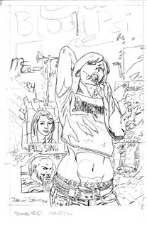
Then i layed out the image on the page, laying down most of the basic linework for the main character and figuring out where to place the posters . This is always really tricky. If you get something wrong at this stage and don't fix it then it'll be too late down the line. After this stage the drawing gets too worked on to fix any mistakes easily.


So once all the important information was down on the page, i tightened up the image, finishing details, fleshing out the face, worked out the blood pattern on the arm, finished the poster images and added some paint scrapes and graffitti to the wall. In the pencils i always try to work out where my blacks will go. You can never be 100% sure how it'll turn out, but you get a basic idea.

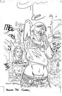
After i finished the pencils, i took my pens and went over the image, filling in little details like eyes and scrapes with my smallest, and bigger information with my larger ones. I took a brush pen and made a heavier line weight around the main character and at the bottom of some of the posters. At the end, i'm left with all the linework taken care of, leaving my favourite bit:


Filling in the blacks. I love, love, LOVE black on the page. When i go over the image with the ink-filled brush, the whole piece 'pops' for me. I filled in all the parts i marked to be filled, but i wasn't fully happy. I had a lot of information on the page and i thought i needed to do something, to relax the eye. So i decided to add some shadow to the top and bottom of the right side of the page. Nothing mad, i just needed to balance it out a bit, if that makes sense.


So, that's it. Cover finished. Or is it? I'm gonna colour this piece too, doing a step by step job like i did here. I normally just tear through a page, just trying to get it done. I rarely scan a piece midway. Mainly cuz of laziness, but also, it takes time to stop and scan, where i'm usually too impatient and just wasnt to finish the piece. If anyone would like to see me do this more often, let me know, otherwise i probably won't bother.

Back in a couple of days with the colours.

dec.