
I was showing work around in San Diego a month back, when i met one editor who liked my work. He said to me, "I can tell you have a great sense of where you want colours to go." Of course, i agreed with him and told him i knew exactly what colours i'd use when colouring. This was black and white artwork, by the way. The truth is, i haven't a CLUE about what colours i'd use if colouring. When i draw, i think in black and white. When the time comes to colour a piece, i really have to look at a piece for ages before i can figure out how exactly i'm going to ruin this black and white work!
Well, anyway, here's how i go about doing that.
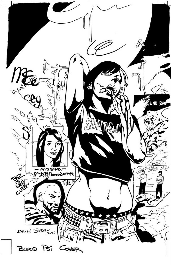
Well, first i look at the black and white piece, imagining what colours i'd put where. The only thing i thought i might go with was having the wall green, and the graf above pink. The vampire character had to have a white bleached part in her hair and a blue and red t-shirt, cuz i'd coloured an image of her with those colours, for a banner months back. So, i get started. I tinker with the image on Photoshop, preparing it for the colouring stage. Then i just get on with 'flating'.

'Flats' are where you basically map out where the colour will go. The colours you use aren't really important, you just trace under the black line art with the mouse and fill it with a block of colour. As you can see, i filled in areas with colours like those i had in mind. You can chance colours to whatever you like after this, but i thought it was looking okay at this stage, so continued colouring using these colours for now.
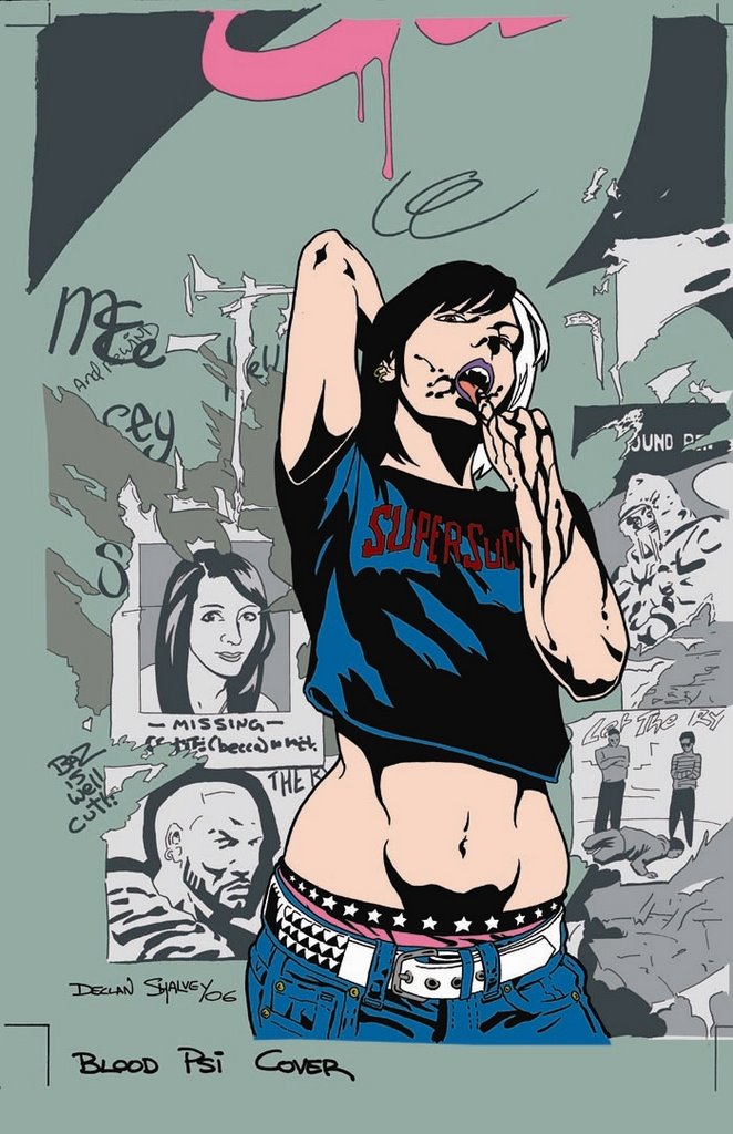 I knew I wanted the vamp to stand out some more, so after i seperated the posters with more greys, i did a colour-hold on the background line art. Not sure how visible it is here, but the linework is changed to grey where the vamp's remains black. She stands out more that way. At this point i was going to add texture to the wall and shading to the character. I took a break and had a shower. When doing the showering thing my mind wandered (as it does) and i realised the colours i was using were too boring. I like muted colours, but this was a cover. It had to stand out on a shelf so i thought i'd be a little more daring. I decided i needed some Red.
When i came back, things got radically different. I went with a powerful red for a background and made any other background details a different tone of red. I then thought, "Why is her skin pink? She's a Vampire, for feck's sake!" When adding flats, i had gone with a basic pink, and never changed it, so i went drastic again; pure white. BAM! It was coming together. The image demanded more attention. See, cuz my work is mainly solid black and solid white, i can get away with hard, graphic colours. There wasn't much point in doing a heavily-rendered image on this cover, it would end up being too fussy and confuse the eye. I needed something to attract the eye, and the basic red-and-white approach did that. I made a dark-red colour-hold for the blood and brightened the red on the t-shirt to match the background. I Also added a light yellow to the hair and other details. The important thing now was to keep the colour palette limited. If there were too many different colours it would work against keeping a simple approach.

Now, the image was basically done, but i wanted to add a couple of extra touches. First, I adjusted the grey colour-hold to compensate for the new red background. Then I changed the colour of her underwear to match the blood, unstead of the hair. I added a soft gradient to the background to give some indication of a lightsource, but also to soften the background a little. On top of that, i thought when the logo was on the cover it would stand out a bit more against the light area. The important thing was to make sure i didn't lighten it too much, otherwise you'd be distracted from the white skin on the vamp, and it was she who had to stand out most. I thought i should add a little shading to the vamp's skin. Just a little, mind. There was so much white i wanted to tone it down just a little, so added some soft grey shading to some areas.
So that's it. All done. Ended up quite happy with it in the end. I really liked the black and white version and was scared of ruining it but in the end, it worked out okay. The only thing left to do is to thank Andy Winter, who offered the cover to me, Marianne Kenny, who was kind enough to model for the vampire character (the piece ended up WAY better cuz of it. I know that for a fact) and also her sister Cecily Kenny (who gave me permission to ask her little sister to model in the first place!).
Also. thanks to everyone who left comments on the last post and to whoever comment on this one.
I'm outta here.
Dec.
6 comments:
Hey Dec,
This is an awesome cover process. And I don't just mean the colors section, but the pencils to inks section below is equally amazing. I actually just posted a cover process for my Night Star project just yesterday, so I can really appreciate this particular entry. I was amused by your little sidenote heading this post. Hopefully that editor never reads this blog! Heh heh. I was also really amazed about how you were able to make such a steep, bold departure with the colors when you added the red. I'm sure you could just photoshop it out or whatever if it didn't work, but it takes brass ones to make the attempt anyway. Nicely done.
Well done man, I really love it, I remember when little miss kenny was young and innocent, she looks great in it, you captured her perfectly...By the way I've been pimping your page through myspace, just telling people to check out your work.Cos they should, cos it rocks, or something...I'm being a lazy bum and avoiding doing work.I'll see ya when i get back from Italy
-ruth
Disgustingly pro work again you prick!
Love it, great content on this here blog. Where are the ref pics you took?
Don't answer that.
Hey Mike, yeah, on photoshop, you can always change it, but i thought i knew how i wanted it to look, but you have to take a step back sometimes (which is hard to do). I realised the point was to grab attention, not to do a nice little coloured drawing, so had to approach it differently. Thanks for your comment.
Ruth, get off the net and enjoy italy!!! Thanks for all that pimping though ....i'm such a whore. See you soon.
Bob, i've lots of ref pics of graffitti and ripped posters, if that's what you mean......
Dec
by the way italy fucking rocks, the men here are so damned beautiful, but kinda gay too so that sucks. im drunk by the way, i just got back from an amazing wedding, wow my frinds are all grown up. i think you should take some reference pics of my friend shane, he looks like a superhero,facially and body wise. think he would get a kick out of it too. im gonna go now and leave other drunken comments for other peoples.
Holy jeebus, me mate in Dublin pointed me at this and... cool as! :)
(Yeah, I know a comment that's a little more *intelligent* would be a boon, but I already had my Thought for today...)
Post a Comment